Home run analysis

Introduction
In this post, I’m going to explore a baseball dataset that was recently used in the Sliced machine learning competition on Kaggle. The goal was to build a model to predict home runs. In the competition, log loss was used to evaluate model performance. We will build and tune several models to compare with each other and the Sliced competition leaderboard.
During the Sliced competition, Jesse Mostipak and David Robinson used the meme package to woo the online audience and win the popular vote. Who knew that cat memes and machine learning went so well together? So, of course, I knew I had to give the package a whirl in my next post. In addition to creating memes, the package can also be used to add an image to the background of plots made with the ggplot2 package.
Before we get started, I would like to add the following disclaimer: I am utterly ignorant about the rules and lingo of baseball but I will try my best to not offend any diehard fans. With that said, let’s start by exploring the variables we have to build our home run prediction model.
library(tidyverse)
library(tidymodels)
library(patchwork)
theme_set(theme_light())
library(grid)
library(meme)
library(ggimage)
library(gt)
doParallel::registerDoParallel()
#u <- system.file("memes/safe.png", package="meme")
u <- "memes/safe.png"
x = meme(u, "Safe!", "Models be like")
x
baseball <- read_csv('train.csv')Data Viz
The baseball dataset has the following features: is_batter_lefty, is_pitcher_lefty, bb_type, bearing, pitch_name, park, inning, outs_when_up, balls, strikes, plate_x, plate_z, pitch_mph, launch_speed, launch_angle. Visualizing our data can help us get a sense of what variables are important for predicting home runs. Let’s first look at the number of home runs by pitch type.
baseball %>%
  filter(pitch_name != 'Forkball') %>%
  mutate(pitch_name = fct_reorder(pitch_name, is_home_run, sum)) %>%
  ggplot(aes(is_home_run, pitch_name, fill = pitch_name)) +
  geom_col() +
  theme(legend.position = 'none') +
  scale_fill_viridis_d(option="plasma", alpha = .9) +
  labs(x='Home runs',
       y='',
       title='Number of home runs by pitch type')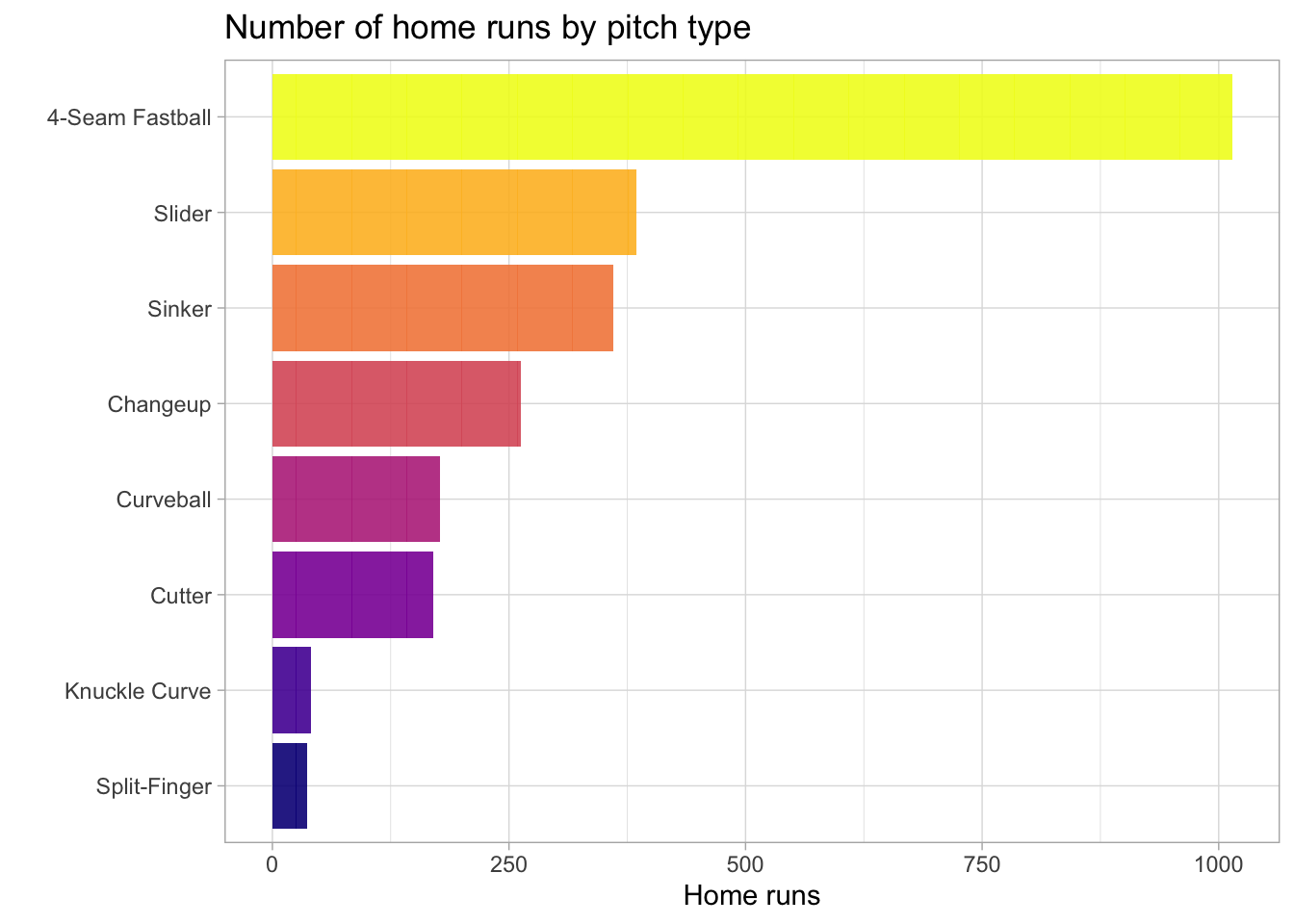
A 4-seem fastball pitch has resulted in the most home runs by far. Next, let’s see what types of batting hits result in a home run.
color2 <- c("#FEBC2AFF", "#F48849FF")
baseball %>%
  filter(bb_type == "line_drive" | bb_type == "fly_ball") %>%
  filter(is_home_run == 1) %>%
  #mutate(pitch_name = fct_reorder(bb_type, is_home_run, sum)) %>%
  ggplot(aes(bb_type, is_home_run, fill = bb_type)) +
  geom_col() +
  theme(legend.position = 'none') +
  #scale_fill_manual(values = color2) +
  labs(x='',
       y='',
       title='Number of home runs for line drive and fly ball hits')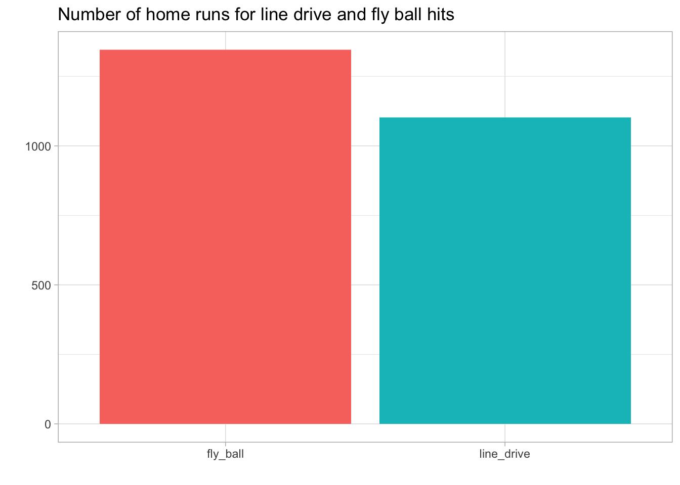
Only the fly ball and line drive result in a home run. The next two plots use the hit trajectory and coordinates relative to home plate to see where home runs occur. For enhanced satisfaction, I’ve added a baseball field to the first plot. This is more of a qualitative image since the position of the field is based on an image and not actual coordinates.
s <- "memes/bb_field.png"
v = meme(s)

baseball %>%
  ggplot(aes(plate_x, plate_z, z = is_home_run)) +
  geom_subview(x = 0, y = 0, subview= v + aes(size=3), width=Inf, height=Inf) +
  stat_summary_hex(bins=15) +
  scale_fill_viridis_c(option = 'A', labels = percent, alpha = .4) +
  scale_x_continuous(limits=c(-2,2)) +
  labs(title = "Hex plot using color to represent homerun percentage based on the\
       ball's trajectory coordinates", x = 'Ball position relative to home plate', y = 'Ball height above ground', fill = 'home runs (%)')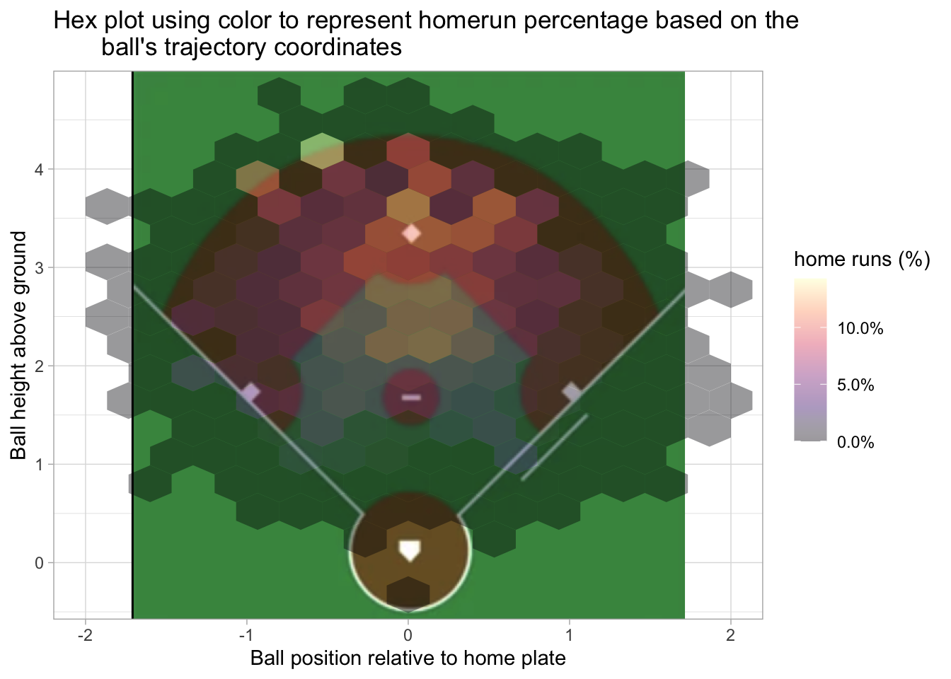
baseball %>%
  ggplot(aes(plate_x, plate_z, z = is_home_run)) +
  stat_summary_hex(bins=15) +
  scale_fill_viridis_c(option = 'A', labels = percent, alpha = .8) +
  scale_x_continuous(limits=c(-2,2)) +
  labs(title = "Hex plot using color to represent homerun percentage based on the\
       ball's trajectory coordinates", x = 'Ball position relative to home plate', y = 'Ball height above ground', fill = 'home runs (%)')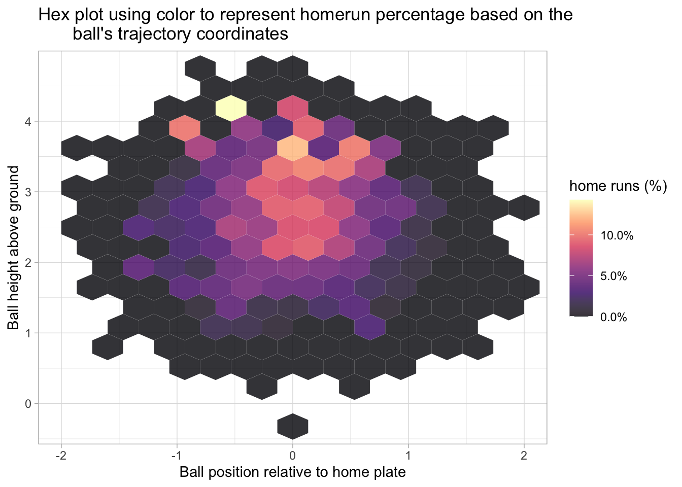
The following two plots also use the hex style fill and consider home runs based on the hit’s launch angle and launch speed.
baseball %>%
  filter(launch_angle >= 10 & launch_angle <= 55, launch_speed >= 85) %>%
  ggplot(aes(launch_angle, launch_speed, z = is_home_run)) +
  geom_subview(x = 0, y = 0, subview=v+aes(size=3), width=Inf, height=Inf) +
  stat_summary_hex(bins=15) +
  scale_fill_viridis_c(option = 'A', labels = percent, , alpha = .5) +
  labs(title = "Hex plot using color to represent homerun\
       percentage based on the ball's launch\
       angle and speed.", x = 'Ball launch angle', y = 'Ball launch speed', fill = 'home runs (%)')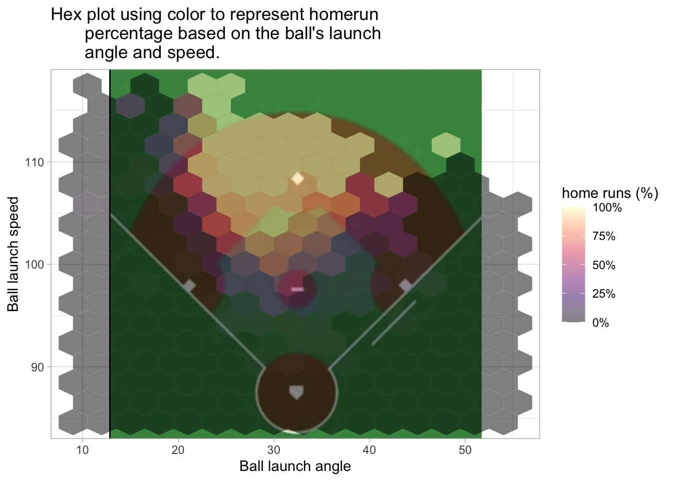
baseball %>%
  filter(launch_angle >= 10 & launch_angle <= 55, launch_speed >= 85) %>%
  ggplot(aes(launch_angle, launch_speed, z = is_home_run)) +
  stat_summary_hex(bins=15) +
  scale_fill_viridis_c(option = 'A', labels = percent, , alpha = .8) +
  labs(title = "Hex plot using color to represent homerun\
       percentage based on the ball's launch\
       angle and speed.", x = 'Ball launch angle', y = 'Ball launch speed', fill = 'home runs (%)')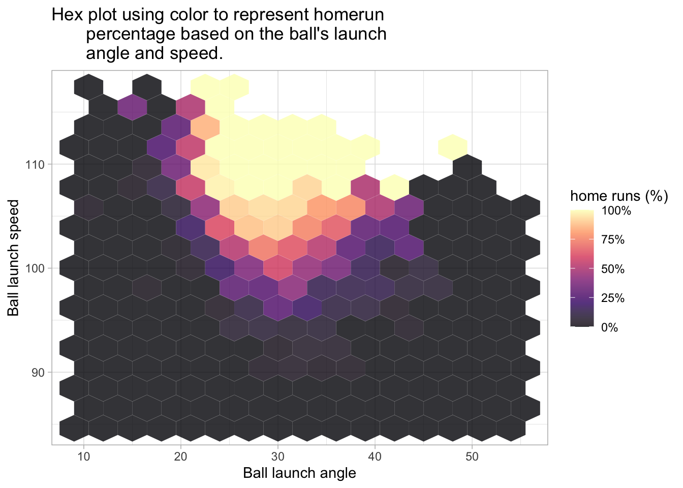
In the next plot, I create three categories for speed and count the number of home runs for each category.
baseball %>%
  mutate(speed_cat = case_when((pitch_mph > 90) ~ "Pitch speed > 80 mph",
                                 (pitch_mph > 80) & (pitch_mph <=  90) ~ "70-80 mph",
                                  (pitch_mph > 70) & (pitch_mph <=  80) ~ "60-70 mph",
                                 TRUE ~ "Pitch speed < 70 mph")) %>%
  group_by(speed_cat) %>%
  filter(is_home_run == 1, speed_cat != 'Pitch speed < 70 mph') %>%
  ggplot(aes(is_home_run, speed_cat, fill = speed_cat)) +
  geom_col() +
  theme(legend.position = 'none') +
  scale_fill_viridis_d() +
  labs(title = "home runs based on Pitch speed",
       x = 'Home runs',
       y = "")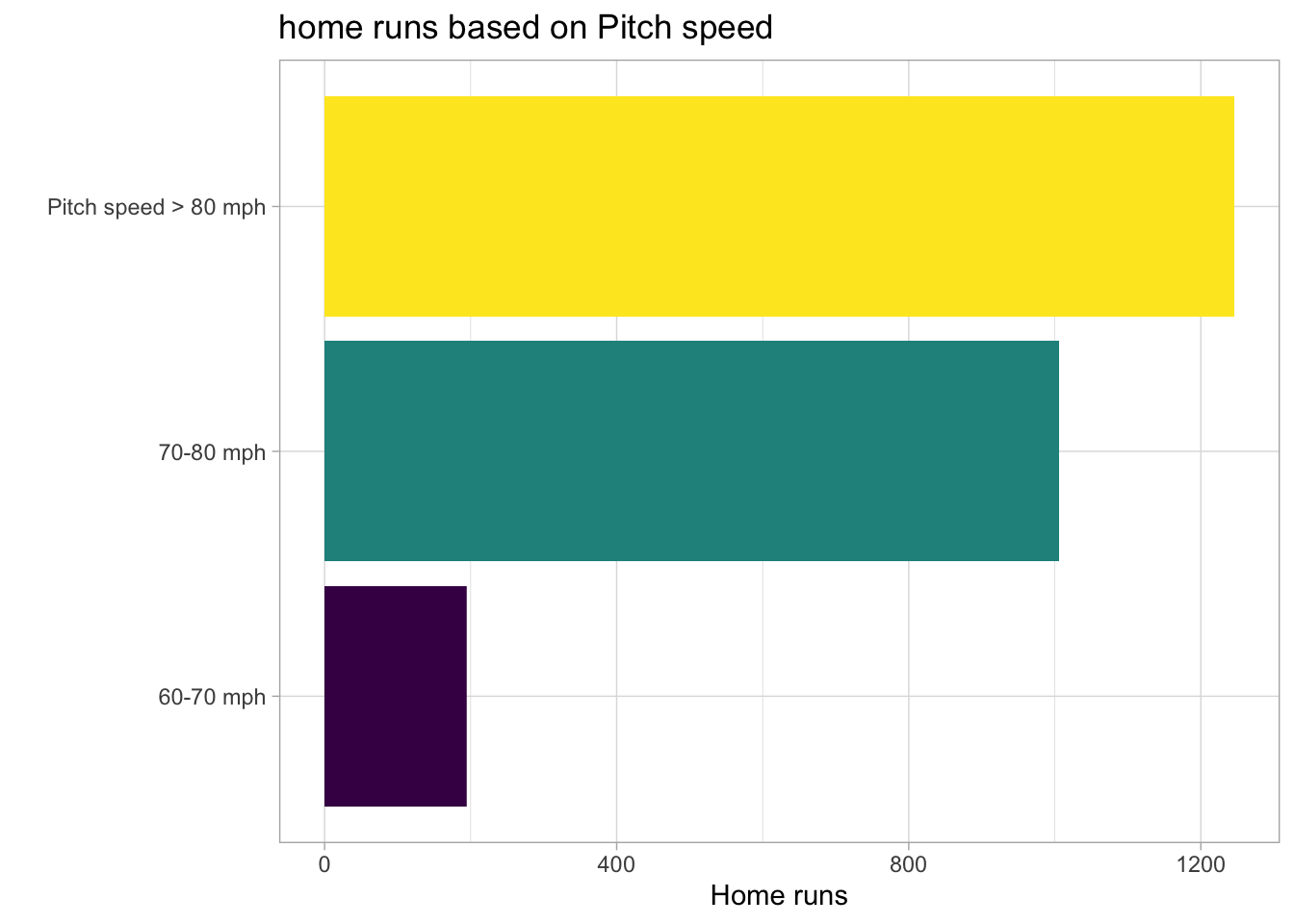
Machine learning
The first step is to clean the data and generate resamples using vfold_cv(). The training set is used for the resamples so as to prevent any data linkage.
# Create splits and resamples
baseball_clean <- baseball %>%
  drop_na() %>%
  mutate(is_home_run = case_when(is_home_run == 1 ~ 'yes',
                                 TRUE ~ 'no'),
         is_home_run = factor(is_home_run))
split <- initial_split(baseball_clean)

home_runs_train <- training(split)
home_runs_test <- testing(split)

folds <- home_runs_train %>%
  vfold_cv(v=5)
Logistic regression
I’m going to use a logistic regression as the first model for comparison. For each model, I will use the log loss and accuracy for evaluation metrics.
glm_recipe <-
  recipe(is_home_run ~ is_batter_lefty + is_pitcher_lefty + pitch_mph +
    launch_speed + launch_angle + plate_x + plate_z, data = baseball_clean) %>%
  step_zv(all_predictors())

glm_spec <- logistic_reg() %>%
  set_mode("classification") %>%
  set_engine("glm")

glm_workflow <-
  workflow(glm_recipe, glm_spec)

set.seed(1013)
glm_fit_resamps <- fit_resamples(
  glm_workflow,
  resamples = folds,
  metrics = metric_set(accuracy, mn_log_loss),
  control = control_resamples(save_pred = TRUE))

glm_fit_resamps %>% collect_metrics() %>%
  select(.metric, .estimator, .estimate = mean) #%>%
## # A tibble: 2 × 3
## .metric .estimator .estimate
## <chr> <chr> <dbl>
## 1 accuracy binary 0.951
## 2 mn_log_loss binary 0.119 # gt() %>%
# tab_header(title = md("**Logistic regression results**")) %>%
# tab_options(container.height = 400,
# container.overflow.y = TRUE,
# heading.background.color = "#21908CFF",
# table.width = "75%",
# column_labels.background.color = "black",
# table.font.color = "black") %>%
# tab_style(style = list(cell_fill(color = "gray")),
# locations = cells_body()) Random forest model
In the code chunk I will tune a random forrest model, select the best hyperparameters and then use the last_fit() function to train the model on the training data and predict on the testset.
ranger_recipe <-
  recipe(formula = is_home_run ~ is_batter_lefty + is_pitcher_lefty + pitch_mph +
    launch_speed + launch_angle + plate_x + plate_z, data = baseball_clean)

ranger_spec <-
  rand_forest(mtry = tune(), min_n = tune(), trees = 1000) %>%
  set_mode("classification") %>%
  set_engine("ranger")

ranger_workflow <-
  workflow() %>%
  add_recipe(ranger_recipe) %>%
  add_model(ranger_spec)

set.seed(90431)
ranger_tune <-
  tune_grid(ranger_workflow,
            resamples = folds,
            grid = 20,
            metrics = metric_set(accuracy, mn_log_loss),
            control = control_resamples(save_pred = TRUE)
            )

ranger_tune %>% autoplot()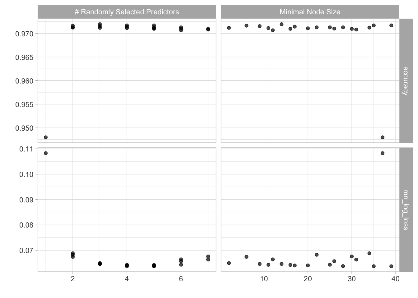
best_params <- ranger_tune %>%
  select_best()

final_wkflow <- finalize_workflow(ranger_workflow, best_params)

final_fit <- last_fit(final_wkflow, split)

final_fit %>%
  collect_metrics() %>%
  select(-.config, Metric = .metric, Estimate = .estimate, Estimator = .estimator) #%>%
## # A tibble: 2 × 3
## Metric Estimator Estimate
## <chr> <chr> <dbl>
## 1 accuracy binary 0.974
## 2 roc_auc binary 0.980 # gt() %>%
# tab_header(title = md("**Random forrest results**")) %>%
# tab_options(container.height = 400,
# container.overflow.y = TRUE,
# heading.background.color = "#21908CFF",
# table.width = "75%",
# column_labels.background.color = "black",
# table.font.color = "black") %>%
# tab_style(style = list(cell_fill(color = "gray")),
# locations = cells_body())XGboost model
No modeling post is complete without an XGboost model. We will follow the similar tuning procedure as was done for the random forest model.
xgboost_recipe <-
  recipe(is_home_run ~ is_batter_lefty + is_pitcher_lefty + pitch_mph +
    launch_speed + launch_angle + plate_x + plate_z, data = baseball_clean) %>%
  #step_string2factor(one_of(is_home_run)) %>%
  step_zv(all_predictors())

xgboost_spec <-
  boost_tree(trees = 1000,
             min_n = tune(),
             tree_depth = tune(),
             learn_rate = tune(),
    loss_reduction = tune(),
    sample_size = tune()) %>%
  set_mode("classification") %>%
  set_engine("xgboost")

xgboost_workflow <-
  workflow() %>%
  add_recipe(xgboost_recipe) %>%
  add_model(xgboost_spec)

set.seed(99176)
xgboost_tune <-
  tune_grid(xgboost_workflow,
            resamples = folds,
            grid = 5,
            metrics = metric_set(accuracy, mn_log_loss),
            control = control_resamples(save_pred = TRUE))

xgboost_tune %>% autoplot()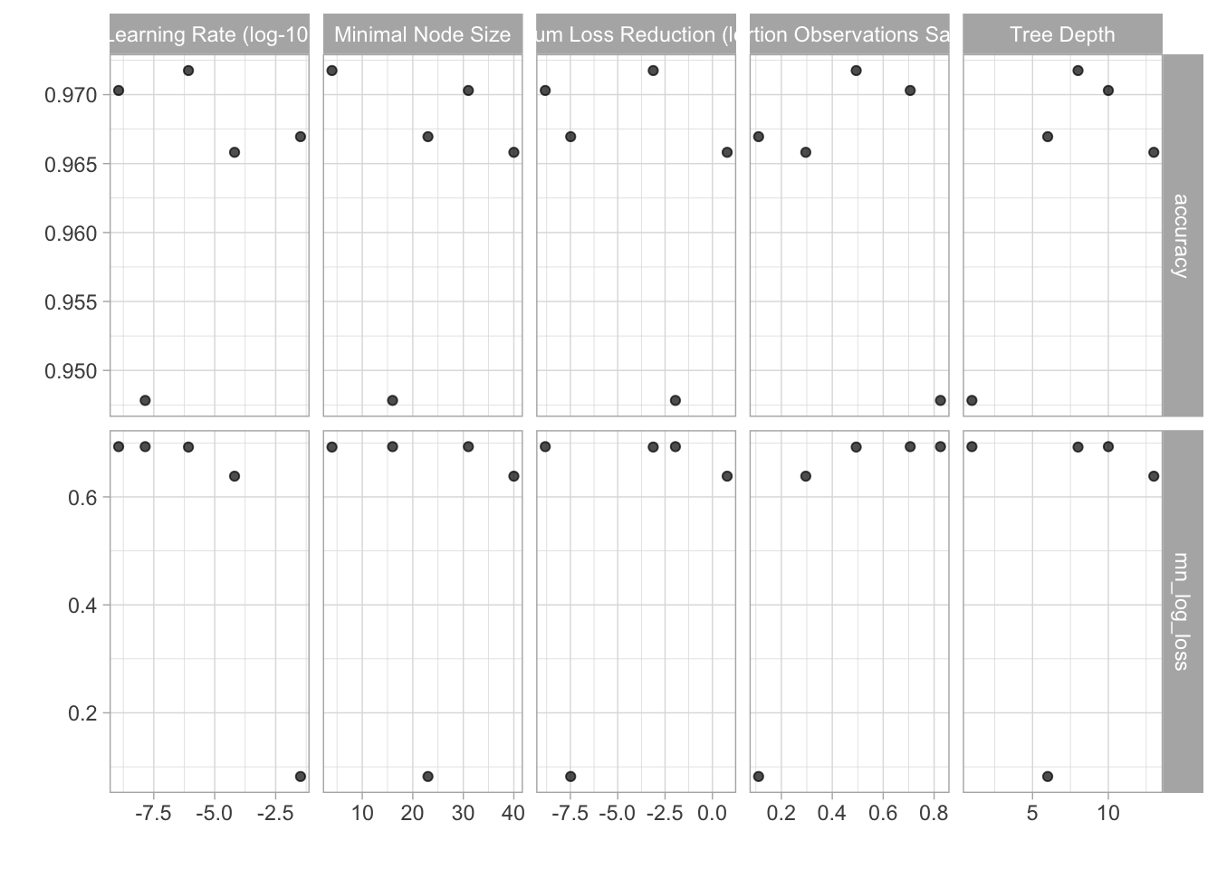
xg_best_params <- xgboost_tune %>%
  select_best()

xg_final_wkflow <- finalize_workflow(xgboost_workflow, xg_best_params)

xg_final_fit <- last_fit(xg_final_wkflow, split)

xg_final_fit %>%
  collect_metrics() %>%
  select(-.config, Metric = .metric, Estimate = .estimate, Estimator = .estimator) #%>%
## # A tibble: 2 × 3
## Metric Estimator Estimate
## <chr> <chr> <dbl>
## 1 accuracy binary 0.974
## 2 roc_auc binary 0.971 # gt() %>%
# tab_header(title = md("**XGboost results**")) %>%
# tab_options(container.height = 400,
# container.overflow.y = TRUE,
# heading.background.color = "#21908CFF",
# table.width = "75%",
# column_labels.background.color = "black",
# table.font.color = "black") %>%
# tab_style(style = list(cell_fill(color = "gray")),
# locations = cells_body())Summary Results
model = c("glm", "glm", "random forest", "random forest", "xgboost", "xgboost")
bind_rows(glm_fit_resamps %>%
            collect_metrics() %>%
            select(.metric, .estimator, .estimate = mean),
          final_fit %>%
  collect_metrics(),
  xg_final_fit %>%
  collect_metrics()) %>%
  bind_cols(tibble(model)) %>%
  select(-.config, model,  Metric = .metric, Estimate = .estimate, Estimator = .estimator) %>%
  select(model, everything()) %>%
  gt() %>%
  tab_header(title = md("**Model summary results**"))  %>%
  tab_options(container.height = 400,
              container.overflow.y = TRUE,
              heading.background.color = "#21908CFF",
              table.width = "75%",
              column_labels.background.color = "black",
              table.font.color = "black") %>%
  tab_style(style = list(cell_fill(color = "gray")),
locations = cells_body())| Model summary results | |||
|---|---|---|---|
| model | Metric | Estimator | Estimate |
| glm | accuracy | binary | 0.9510207 |
| glm | mn_log_loss | binary | 0.1187313 |
| random forest | accuracy | binary | 0.9740179 |
| random forest | roc_auc | binary | 0.9803071 |
| xgboost | accuracy | binary | 0.9737086 |
| xgboost | roc_auc | binary | 0.9709157 |
The accuracy turned out to be slightly better for the random forest and xgboost models but there was no standout winner. The models appear to have worked really well..I would like to go beyond the test data and see how they perform. I would also still like to compare them to the Sliced leaderboard but, for some reason, the log loss metric was not computed for the latter two models. One question that I plan to follow up on is whether I should down sample the data. I assume there is an overrepresentation of hits that are not home runs. Although we would lose a lot of data, it could result in a much more accurate model.
Gabriel Mednick, PhD
Data scientist, biochemist, computational biologist, educator, life enthusiast