Transcriptomic analysis of yeast in response to selective nutrient limitation
This post is still under construction
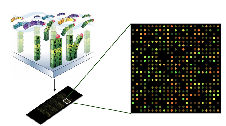
Yeast microarray data
In biology, the term ‘omics’ is used to refer to studies that involve a meta view of the behavior of an entire class of molecules. Omics can refer to a range of disciplines, including genomics, proteomics, metabolomics, metagenomics and transcriptomics. This post will focus on transcriptomics, the field of study that looks at RNA expression and transcriptional regulation in response to specific changes. We will be using gene expression data from Brauer et al, 2008. The title of their paper provides a powerful summary of the experiment and what they learned from the data: ‘Coordination of Growth Rate, Cell Cycle, Stress Response, and Metabolic Activity in Yeast’.
In my last two posts, I have tried to emphasize the use of Bioconductor packages and the Tidyverse in a seamless analysis workflow. Although we may ultimately be working with specialized bioinformatics packages such as Deseq2, EdgeR or Lima for analysis of transcriptomic data, David Robinson notes that ‘Any challenge in plotting, filtering, or merging your data will get directly in the way of answering scientific questions’. This is why the Tidyverse is essential to any analysis workflow.
As noted, the data is from yeast and the gene expression levels were measured under conditions of selective nutrient starvation. Growth rates were also carefully controlled by using a chemostat to regulate the flow of fresh growth media. The expression data was collected using a microarray. Microarrays measure expression levels as fluorescence intensities that are proportional to the number of sequences that bind to the complementary probe sequences of the array. RNA-seq experiments are considered more accurate since all RNA transcripts are counted directly.
Before we dive into the deeps of this analysis, I want to give credit and thanks to David Robinson. David is one of the most insightful and inspiring data scientists on the planet. He has a few courses on DataCamp and regularly livestreams data analysis with R, the Tidyverse and Tidymodels. This post will closely follow a series of posts by David that focus on working with genomic data.
Let’s start by taking a look at the first few rows of data
# yeast_data <- read_delim("http://varianceexplained.org/files/Brauer2008_DataSet1.tds")
# write_rds(yeast_data, 'yeast_data')
yeast_df <- read_rds("yeast_data")

# yeast_df %>%
#   glimpse()

yeast_df %>%
  head(5) %>%
kableExtra::kable()| GID | YORF | NAME | GWEIGHT | G0.05 | G0.1 | G0.15 | G0.2 | G0.25 | G0.3 | N0.05 | N0.1 | N0.15 | N0.2 | N0.25 | N0.3 | P0.05 | P0.1 | P0.15 | P0.2 | P0.25 | P0.3 | S0.05 | S0.1 | S0.15 | S0.2 | S0.25 | S0.3 | L0.05 | L0.1 | L0.15 | L0.2 | L0.25 | L0.3 | U0.05 | U0.1 | U0.15 | U0.2 | U0.25 | U0.3 |
|---|---|---|---|---|---|---|---|---|---|---|---|---|---|---|---|---|---|---|---|---|---|---|---|---|---|---|---|---|---|---|---|---|---|---|---|---|---|---|---|
| GENE1331X | A_06_P5820 | SFB2 || ER to Golgi transport || molecular function unknown || YNL049C || 1082129 | 1 | -0.24 | -0.13 | -0.21 | -0.15 | -0.05 | -0.05 | 0.20 | 0.24 | -0.20 | -0.42 | -0.14 | 0.09 | -0.26 | -0.20 | -0.22 | -0.31 | 0.04 | 0.34 | -0.51 | -0.12 | 0.09 | 0.09 | 0.20 | 0.08 | 0.18 | 0.18 | 0.13 | 0.20 | 0.17 | 0.11 | -0.06 | -0.26 | -0.05 | -0.28 | -0.19 | 0.09 |
| GENE4924X | A_06_P5866 | || biological process unknown || molecular function unknown || YNL095C || 1086222 | 1 | 0.28 | 0.13 | -0.40 | -0.48 | -0.11 | 0.17 | 0.31 | 0.00 | -0.63 | -0.44 | -0.26 | 0.21 | -0.09 | -0.04 | -0.10 | 0.15 | 0.20 | 0.63 | 0.53 | 0.15 | -0.01 | 0.12 | -0.15 | 0.32 | 0.16 | 0.09 | 0.02 | 0.04 | 0.03 | 0.01 | -1.02 | -0.91 | -0.59 | -0.61 | -0.17 | 0.18 |
| GENE4690X | A_06_P1834 | QRI7 || proteolysis and peptidolysis || metalloendopeptidase activity || YDL104C || 1085955 | 1 | -0.02 | -0.27 | -0.27 | -0.02 | 0.24 | 0.25 | 0.23 | 0.06 | -0.66 | -0.40 | -0.46 | -0.43 | 0.18 | 0.22 | 0.33 | 0.34 | 0.13 | 0.44 | 1.29 | -0.32 | -0.47 | -0.50 | -0.42 | -0.33 | -0.30 | 0.02 | -0.07 | -0.05 | -0.13 | -0.04 | -0.91 | -0.94 | -0.42 | -0.36 | -0.49 | -0.47 |
| GENE1177X | A_06_P4928 | CFT2 || mRNA polyadenylylation* || RNA binding || YLR115W || 1081958 | 1 | -0.33 | -0.41 | -0.24 | -0.03 | -0.03 | 0.00 | 0.20 | -0.25 | -0.49 | -0.49 | -0.43 | -0.26 | 0.05 | 0.04 | 0.03 | -0.04 | 0.08 | 0.21 | 0.41 | -0.43 | -0.21 | -0.33 | -0.05 | -0.24 | -0.27 | -0.28 | -0.05 | 0.02 | 0.00 | 0.08 | -0.53 | -0.51 | -0.26 | 0.05 | -0.14 | -0.01 |
| GENE511X | A_06_P5620 | SSO2 || vesicle fusion* || t-SNARE activity || YMR183C || 1081214 | 1 | 0.05 | 0.02 | 0.40 | 0.34 | -0.13 | -0.14 | -0.35 | -0.09 | -0.08 | -0.58 | -0.14 | -0.12 | -0.16 | 0.18 | 0.21 | 0.08 | 0.23 | -0.29 | -0.70 | 0.05 | 0.10 | -0.07 | -0.10 | -0.32 | -0.59 | -0.13 | 0.00 | -0.11 | 0.04 | 0.01 | -0.45 | -0.09 | -0.13 | 0.02 | -0.09 | -0.03 |
  # gt() %>%
  # tab_style(
  #   style = list(
  #     cell_fill(color = "#E0FFFF"),
  #     cell_text(weight = "bold")
  #     ),
  #   locations = cells_body())
Cleaning the data
Now that we’ve seen the data, let’s talk about how we can make the information more useful by tidying it. A Tidy data frame should have one variable per column and one observation per row. In the Brauer data, the NAME column has multiple pieces of information separated by ‘||’. Similarly, the numeric column names are made up of the nutrient that is being limited in growth media and the growth rate. The respective values are the relative expression levels for each gene under the given conditions. Enough talk, let’s code.
# I'm going to pivot the table longer by combining all nutrient conditions into one column and expression values into another. Then we can separate and the information in the above mentioned columns in only a couple of steps using separate()
yeast_df_tidy <- yeast_df %>%
  pivot_longer(G0.05:U0.3, names_to = 'nutrient_growth', values_to = 'expression_levels') %>%
  separate(nutrient_growth, c("nutrient", "growth_rate"), sep = 1, convert = TRUE) %>%
  separate(NAME, c('gene_name', 'molec_process', 'activity', 'sys_id', 'id'), sep = "\\|\\|") %>%
  mutate(across(everything(), str_squish),
         growth_rate = as.numeric(growth_rate),
         expression_levels = as.numeric(expression_levels),
         activity = str_remove(molec_process, "[*]"),
         molec_process = str_remove(activity, "[*]"),
         molec_process = str_remove(activity, "activity")) %>%
  janitor::clean_names() # clean column names
# growth_rate and expression_levels are characters-->let's convert them to numeric
Let’s look at the data again after cleaning it!
yeast_df_tidy %>%
  head(5) %>%
kableExtra::kable()| gid | yorf | gene_name | molec_process | activity | sys_id | id | gweight | nutrient | growth_rate | expression_levels |
|---|---|---|---|---|---|---|---|---|---|---|
| GENE1331X | A_06_P5820 | SFB2 | ER to Golgi transport | ER to Golgi transport | YNL049C | 1082129 | 1 | G | 0.05 | -0.24 |
| GENE1331X | A_06_P5820 | SFB2 | ER to Golgi transport | ER to Golgi transport | YNL049C | 1082129 | 1 | G | 0.10 | -0.13 |
| GENE1331X | A_06_P5820 | SFB2 | ER to Golgi transport | ER to Golgi transport | YNL049C | 1082129 | 1 | G | 0.15 | -0.21 |
| GENE1331X | A_06_P5820 | SFB2 | ER to Golgi transport | ER to Golgi transport | YNL049C | 1082129 | 1 | G | 0.20 | -0.15 |
| GENE1331X | A_06_P5820 | SFB2 | ER to Golgi transport | ER to Golgi transport | YNL049C | 1082129 | 1 | G | 0.25 | -0.05 |
Cool, let’s explore some of the benefits of Tidying our data? For starters, we can explore the data with the data visualization package, GGplot2. When we cleaned the data, we separated important annotation information about each gene. Let’s use it to count each category and see what the most common molecular processes are.
# plotting most common gene product associated molecular processes
yeast_df_tidy %>%
  select(gene_name, activity, molec_process, nutrient, growth_rate, expression_levels) %>%
  drop_na(molec_process) %>%
  group_by(gene_name, molec_process) %>%
  count(sort = T) %>%
  ungroup() %>%
  slice(n = 4:20) %>%
  ggplot(aes(n, fct_reorder(molec_process, n), fill = molec_process)) +
  geom_col() +
  theme(legend.position = 'none') +
  labs(title = 'Most common molecular processes',
       subtitle = "Gene count in yeast",
       y = NULL,
       x = NULL) +
  theme(plot.title = element_text(color = "blue", size = 14, face = "bold", hjust = -1))
Let’s also look at the annotation for gene product activity.
# plotting most common gene product function
yeast_df_tidy %>%
  select(gene_name, activity, molec_process, nutrient, growth_rate, expression_levels) %>%
  drop_na(activity) %>%
  group_by(gene_name, activity) %>%
  count(sort = T) %>%
  ungroup() %>%
  slice(n = 4:20) %>%
  ggplot(aes(n,fct_reorder(activity, n), fill = activity)) +
  geom_col() +
  theme(legend.position = 'none') +
  labs(title = "Most common gene product activity",
       subtitle = "Gene count in yeast",
       y = NULL,
       x = NULL) +
  theme(plot.title = element_text(color = "blue", size = 14, face = "bold", hjust = -1))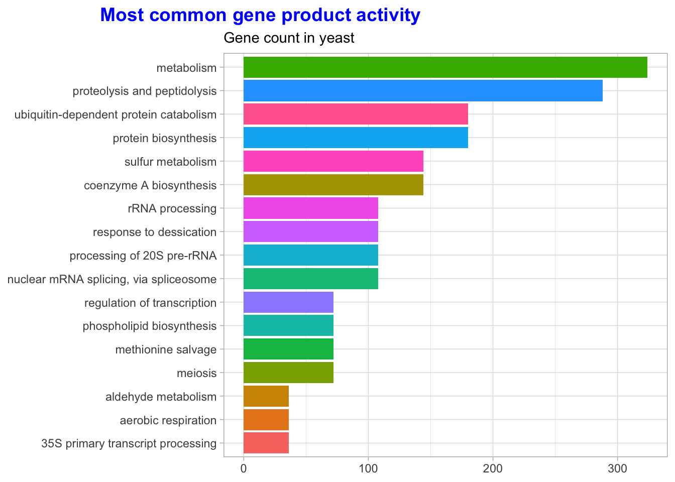
Visualizing relationships in our data can help us check for inconsistencies and deepen our intuition about the relationships between variables. For instance, let’s consider how expression levels depend on growth rate for each of the nutrient limiting categories. Genes that show an increase or decrease in expression are likely directly affected by the specific nutrient limitation.
#For readability, let's also replace the nutrient symbols with their respective names
nutrients <- c(G = 'Glucose', L = 'Leucine', N = 'Nitrogen', P  = 'Phosphate', S =
'Sulfate', N = 'Ammonia', U = 'Uracil')

yeast_df_tidy <- yeast_df_tidy %>%
  mutate(nutrient = recode(
    nutrient, !!!nutrients
  )) # !!! is referred to as the splice operator -- it injects a list of arguments into a function call (can be used in place of do.call)
Let’s look at a couple of individual genes under each nutrient limiting condition and then expand our visual exploration to look for patterns based on activity or molecular process.
yeast_df_tidy %>%
  select(gene_name, activity, molec_process, nutrient, growth_rate, expression_levels) %>%
  filter(gene_name == "SUL1") %>%
  ggplot(aes(growth_rate, expression_levels, color = nutrient)) +
  geom_line() +
  labs(title = "Expression levels vs growth rate for SUL1",
       subtitle = "SUL1 is involved in sulfate transport",
       x = "Growth rate",
       y = "Expression")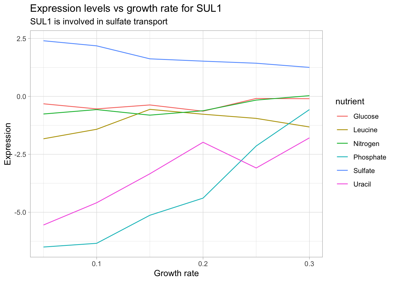
According to the Saccharomyces genome database, SUL1 is a ‘High affinity sulfate permease of the SulP anion transporter family; sulfate uptake is mediated by specific sulfate transporters Sul1p and Sul2p, which control the concentration of endogenous activated sulfate intermediates’. We see that SUL1 expression decreases with increasing growth rate under sulfate limitation. It’s also interesting to note that SUL1 expression increases under phosphate and uracil limitation. This analysis can lend itself to insights regarding the gene product’s function and corresponding phenotype changes.
This time, let’s try a gene whose protein product is directly involved in the synthesis of a limiting nutrient. For this, we will use LEU1 which is involved in the synthesis of leucine.
yeast_df_tidy %>%
  select(gene_name, activity, molec_process, nutrient, growth_rate, expression_levels) %>%
  filter(gene_name == "LEU1") %>%
  ggplot(aes(growth_rate, expression_levels, color = nutrient)) +
  geom_line() +
  labs(title = "Expression levels vs growth rate for LEU1",
       x = "Growth rate",
       y = "Expression")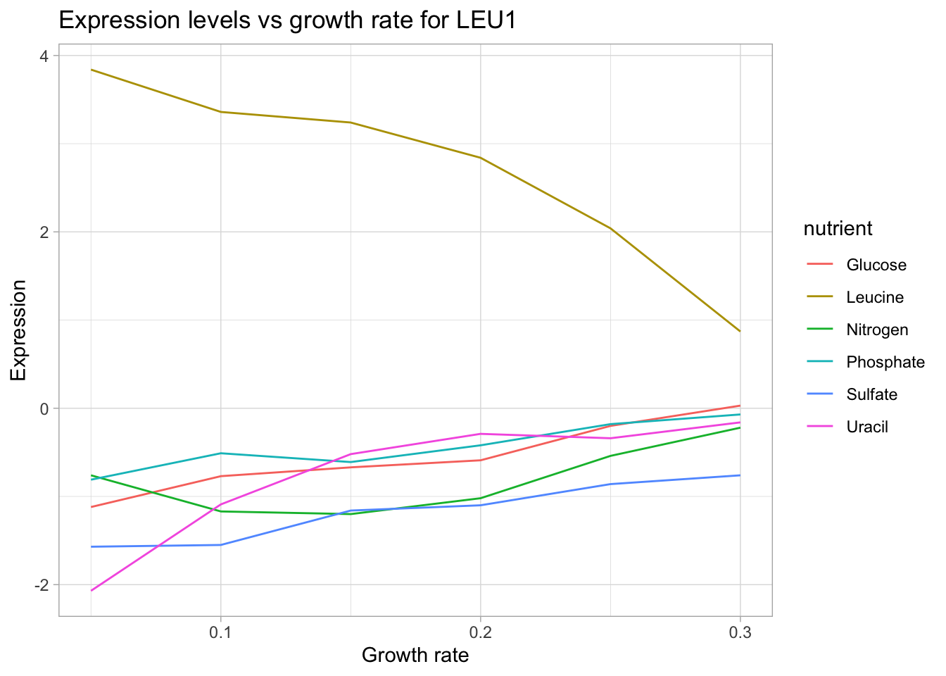
Now, we can see a very clear trend: As growth rate increasing (increasing availability of leucine in the growth media) the in-house machinery for leucine biosynthesis is turned down.
Let’s use filter() and facet_wrap() to search for gene products involved in different categories to get a better sense of our data.
yeast_df_tidy %>%
  select(gid, gene_name, activity, molec_process, nutrient, growth_rate, expression_levels) %>%
  filter(grepl("leucine biosynthesis", activity),
         gene_name != "") %>%
  group_by(gene_name, gid, nutrient) %>%
  ungroup() %>%
  distinct(gene_name, .keep_all = T) %>%
  select(gene_name, activity, molec_process, nutrient) %>%
kableExtra::kable() | gene_name | activity | molec_process | nutrient |
|---|---|---|---|
| LEU9 | leucine biosynthesis | leucine biosynthesis | Glucose |
| LEU1 | leucine biosynthesis | leucine biosynthesis | Glucose |
| LEU2 | leucine biosynthesis | leucine biosynthesis | Glucose |
| LEU4 | leucine biosynthesis | leucine biosynthesis | Glucose |
yeast_df_tidy %>%
  select(gid, gene_name, activity, molec_process, nutrient, growth_rate, expression_levels) %>%
  filter(grepl("leucine biosynthesis", activity),
         gene_name != "") %>%
  group_by(gene_name, gid, nutrient) %>%
  #group_slice(1:35) %>%
  ggplot(aes(growth_rate, expression_levels, color = nutrient, group = nutrient)) +
  geom_line() +
  facet_wrap(~gene_name, scales = 'free') +
  labs(title = "Expression levels vs growth rate under selective nutrient limitation",
       subtitle = "filtering for genes with 'leucine biosynthesis' activity",
       x = "Growth rate",
       y = "Expression") +
  theme(axis.text.y = element_blank(),
        axis.ticks.y = element_blank())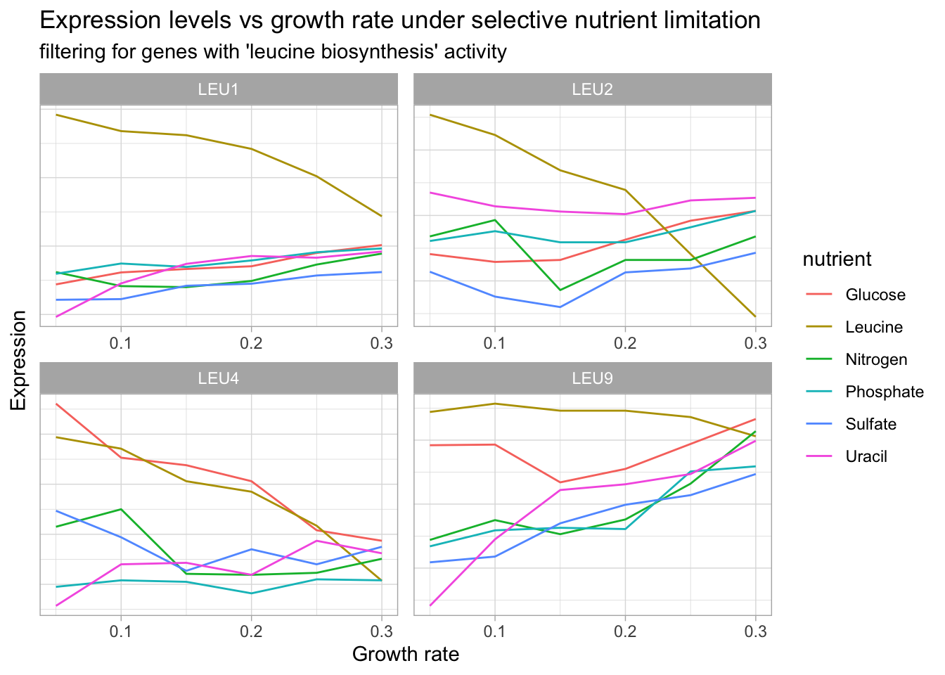
# let's start by looking at the data
yeast_df_tidy %>%
  select(gid, gene_name, activity, molec_process, nutrient, growth_rate, expression_levels) %>%
  filter(grepl("glucose metabolism", activity),
         gene_name != "") %>%
  count(gene_name, molec_process, activity) %>%
  select(-n) %>%
DT::datatable() # Let's visualize genes with glucose metabolism activity
yeast_df_tidy %>%
select(gid, gene_name, activity, molec_process, nutrient, growth_rate, expression_levels) %>%
filter(grepl("glucose metabolism", activity),
gene_name != "") %>%
add_count(gene_name) %>%
group_by(gene_name, gid) %>%
ggplot(aes(growth_rate, expression_levels, color = nutrient, group = nutrient)) +
geom_line() +
facet_wrap(~gene_name, scales = 'free') +
labs(title = "Expression levels vs growth rate under selective nutrient limitation",
subtitle = "Genes associated with glucose metabolism",
x = "Growth rate",
y = "Expression") +
theme(axis.text.y = element_blank(),
axis.ticks.y = element_blank())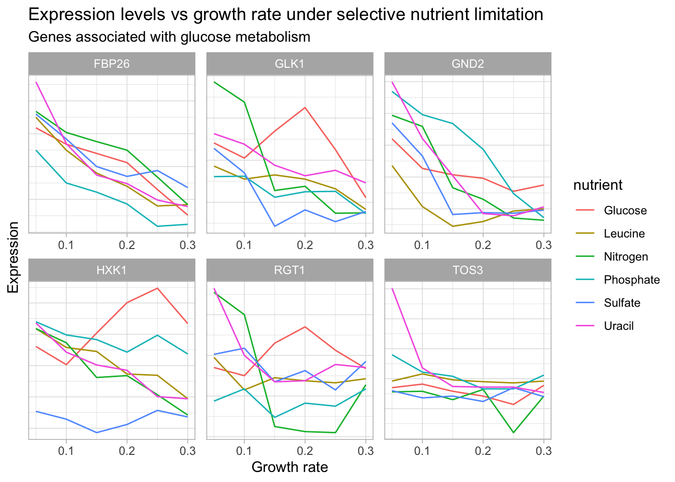
# group_slice function
group_slice <- function(dt, v) {
  stopifnot('data.frame' %in% class(dt))
  stopifnot(v > 0, (v %% 1) == 0)
  if(n_groups(dt) >= 2) #warn('Only 1 group to slice')
  #get the grouping variables
  groups=
    unique(dt %>% select()) %>%
    group_by() %>%
    slice(v)
 #subset our original data
  out = inner_join(dt, groups)
  out
}

#Table for a subset of genes related to glucose metabolism
yeast_df_tidy %>%
  select(gid, gene_name, activity, molec_process, nutrient, growth_rate, expression_levels) %>%
  filter(grepl("nitrogen", activity),
         gene_name != "") %>%
  group_by(gene_name, gid, nutrient) %>%
  #group_slice(1:35) %>%
  ungroup() %>%
  distinct(gene_name, .keep_all = T) %>%
  select(gene_name, activity, molec_process, nutrient) %>%
  DT::datatable()
yeast_df_tidy %>%
select(gid, gene_name, activity, molec_process, nutrient, growth_rate, expression_levels) %>%
#mutate(across(everything(), str_squish)) %>%
filter(grepl("nitrogen", activity),
gene_name != "") %>%
group_by(gene_name, gid, nutrient) %>%
#group_slice(1:35) %>%
ggplot(aes(growth_rate, expression_levels, color = nutrient, group = nutrient)) +
geom_line() +
facet_wrap(~gene_name, scales = 'free') +
labs(title = "Expression levels vs growth rate under selective nutrient limitation",
subtitle = "filtering for genes with 'Nitrogen biosynthesis' activity",
x = "Growth rate",
y = "Expression") +
theme(axis.text.y = element_blank(),
axis.ticks.y = element_blank())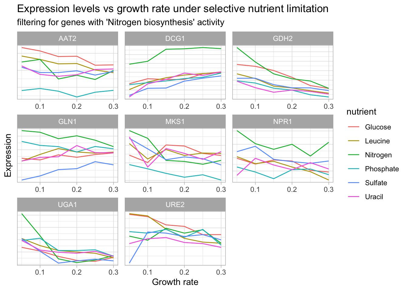
In this next plot, we are going to ‘zoom’ in on one gene and visualize growth rate vs expression as a scatter plot. This time, we will consider each nutrient condition separately using facet_wrap() and fit a linear model to the data points with geom_smooth(method = 'lm').
# Use a named character vector for unquote splicing with !!!
# level_key <- c(a = "apple", b = "banana", c = "carrot")
# recode(char_vec, !!!level_key)

yeast_df_tidy %>%
  mutate(nutrient = recode(nutrient, !!!nutrients)) %>%
  filter(gene_name == "FBP26") %>%
  ggplot(aes(growth_rate, expression_levels, color = nutrient)) +
  geom_point(size = 2) +
  facet_wrap(~ nutrient) +
  geom_smooth(method = 'lm', size = .5) +
  labs(title = 'FBP26 expression vs growth rate under selective nutrient starvation',
       x = "Growth rate",
       y = "Expression levels")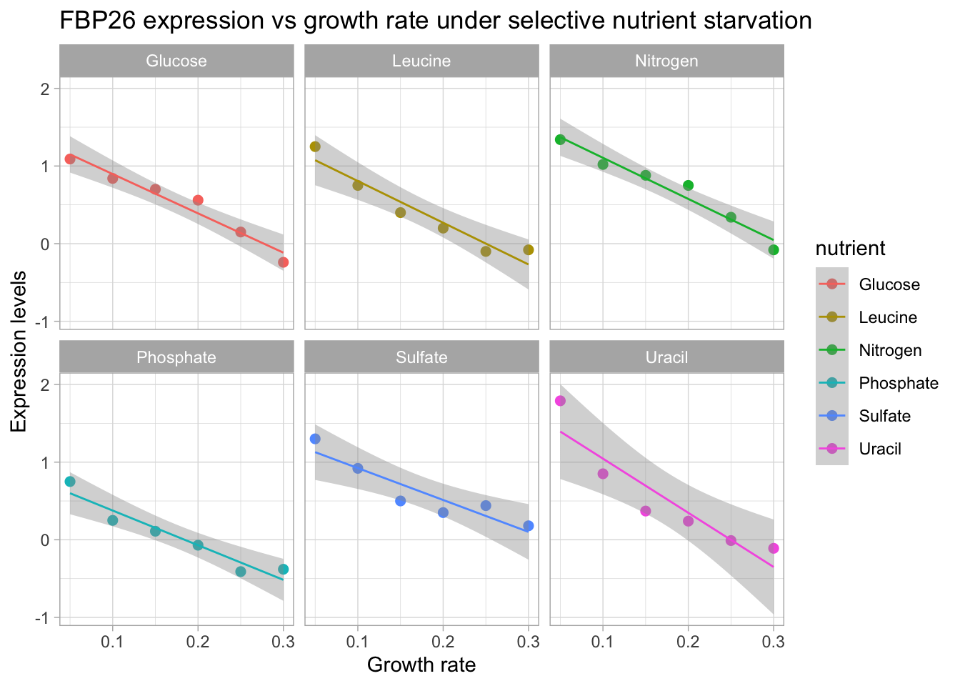
FBP26 exhibits a trend of decreasing expression with increasing growth rate. We see that a linear model fits this trend quite well. In th next section we are going to generate linear models for each gene and nutrient combination. Then we will look at how we can visualize significant genes based on whether they were up or down regulated in relation to growth rate.
Quantifying expression levels with linear regression
We are going to use base R’s lm() function to estimate the expression for each gene-nutrient combination. This can be done by grouping and nesting the data, then using the purrr package to iterate over the samples and return a linear model for each. Finally, we can use the broom package to return a tibble and ggplot2 to look at the results.
library(tidymodels)
library(broom)
library(patchwork)
library(glue)
#David's example of running a linear model for each gene
# linear_models <- yeast_df_tidy %>%
# drop_na(expression_levels) %>%
# group_by(gene_name, gid, nutrient) %>%
# do(tidy(lm(expression_levels ~ growth_rate, .)))
lm_express_mod <- yeast_df_tidy %>%
drop_na() %>%
select(gene_name, gid, nutrient, expression_levels, growth_rate) %>%
group_by(gene_name, gid, nutrient) %>%
nest(-gene_name, -gid, -nutrient)
# Model results were saved as rds file to increase speed of knitting the html post
# model_lm <- lm_express_mod %>%
# mutate(model = map(data, ~lm(expression_levels ~ growth_rate, data = .x)),
# tidy_model = map(model, tidy, conf.int = TRUE)) %>%
# select(gene_name, tidy_model) %>%
# unnest(tidy_model)
#write_rds(model_lm, 'model_tibble')
model_tib <- read_rds("model_tibble")
high_express <- model_tib %>%
filter(term != "(Intercept)") %>%
arrange(desc(estimate)) %>%
drop_na() %>%
filter(gene_name != "") %>%
head(n=15) %>%
mutate(gene_name_nut = glue("{gene_name}-{nutrient}")) %>%
ggplot(aes(estimate, fct_reorder(gene_name_nut, estimate), color = estimate)) +
geom_point() +
geom_errorbarh(aes(xmin = conf.low, xmax = conf.high)) +
labs(title = "Genes that were 'turned on' with increased growth rate",
y = NULL) +
scale_color_viridis_c() +
theme_dark() +
theme(legend.position = 'none')
low_express <- model_tib %>%
filter(term != "(Intercept)") %>%
drop_na() %>%
arrange(desc(estimate)) %>%
filter(gene_name != "") %>%
tail(n=15) %>%
mutate(gene_name_nut = glue("{gene_name}-{nutrient}")) %>%
ggplot(aes(estimate, fct_reorder(gene_name_nut, estimate), color = estimate)) +
geom_point() +
geom_errorbarh(aes(xmin = conf.low, xmax = conf.high)) +
labs(title = "Genes that were 'turned off' with increased growth rate",
y = NULL) +
scale_color_viridis_c(begin = 1, end = 0) +
theme_dark() +
theme(legend.position = 'none')
high_express / low_express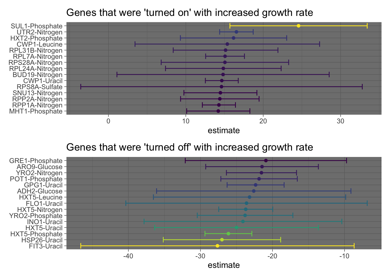 In the previous plot, we used the results from the linear model to visualize the genes with the most positive or negative slopes (estimates) respectively. We also included errorbars to show the 95% confidence intervals.
Let’s create one more visualization to look at the genes with the most positive change in expression in response to growth rate (under one of the nutrient conditions).
over_expressed <- c("SUL1",   "UTR2",   "HXT2",   "CWP1",   "RPL31B", "RPL7A",  "RPS28A", "RPL24A", "BUD19", "CWP1",   "RPS8A",  "SNU13", "RPP2A")

yeast_df_tidy %>%
  select(gid, gene_name, activity, molec_process, nutrient, growth_rate, expression_levels) %>%
  filter(gene_name %in% over_expressed,
         gene_name != "") %>%
  add_count(gene_name) %>%
  group_by(gene_name, gid) %>%
  ggplot(aes(growth_rate, expression_levels, color = nutrient, group = nutrient)) +
  geom_line() +
  facet_wrap(~gene_name, scales = 'free') +
  labs(title = "Expression levels vs growth rate under selective nutrient limitation",
       subtitle = "Most over expressed genes",
       x = "Growth rate",
       y = "Expression") +
  theme(axis.text.y = element_blank(),
        axis.ticks.y = element_blank())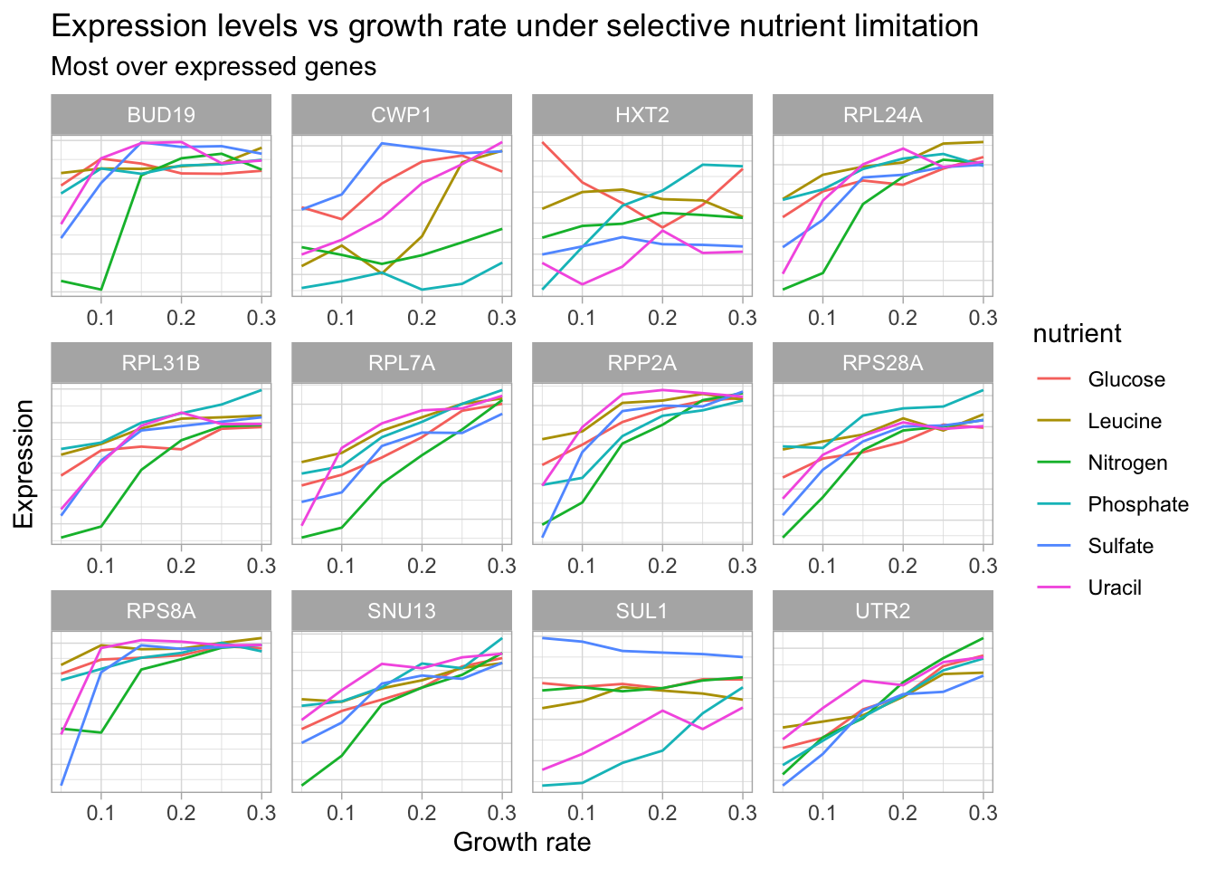
Hopefully this post has convinced you that the tidyverse can be the backbone of any omics analysis. It is essential for data cleaning, visualization, generating models and evaluating the results. That said, an important point was made in the comments of David’s post:
“..If you want to do statistical analysis of genomics data it is better to rely on the Bioconductor packages themselves which have been optimized for the characteristics such as small sample sizes relative to the number of features.”
In a follow up post, I will use an RNA-seq dataset to show how the tidybulk package can seamlessly bridge the tidyverse with specialized Bioconductor packages such as Deseq2, EdgeR and Lima. Until then, tidy on!
Gabriel Mednick, PhD
Data scientist, biochemist, computational biologist, educator, life enthusiast